 THE MAGGIE MARSHALL TEAMLet’s connect

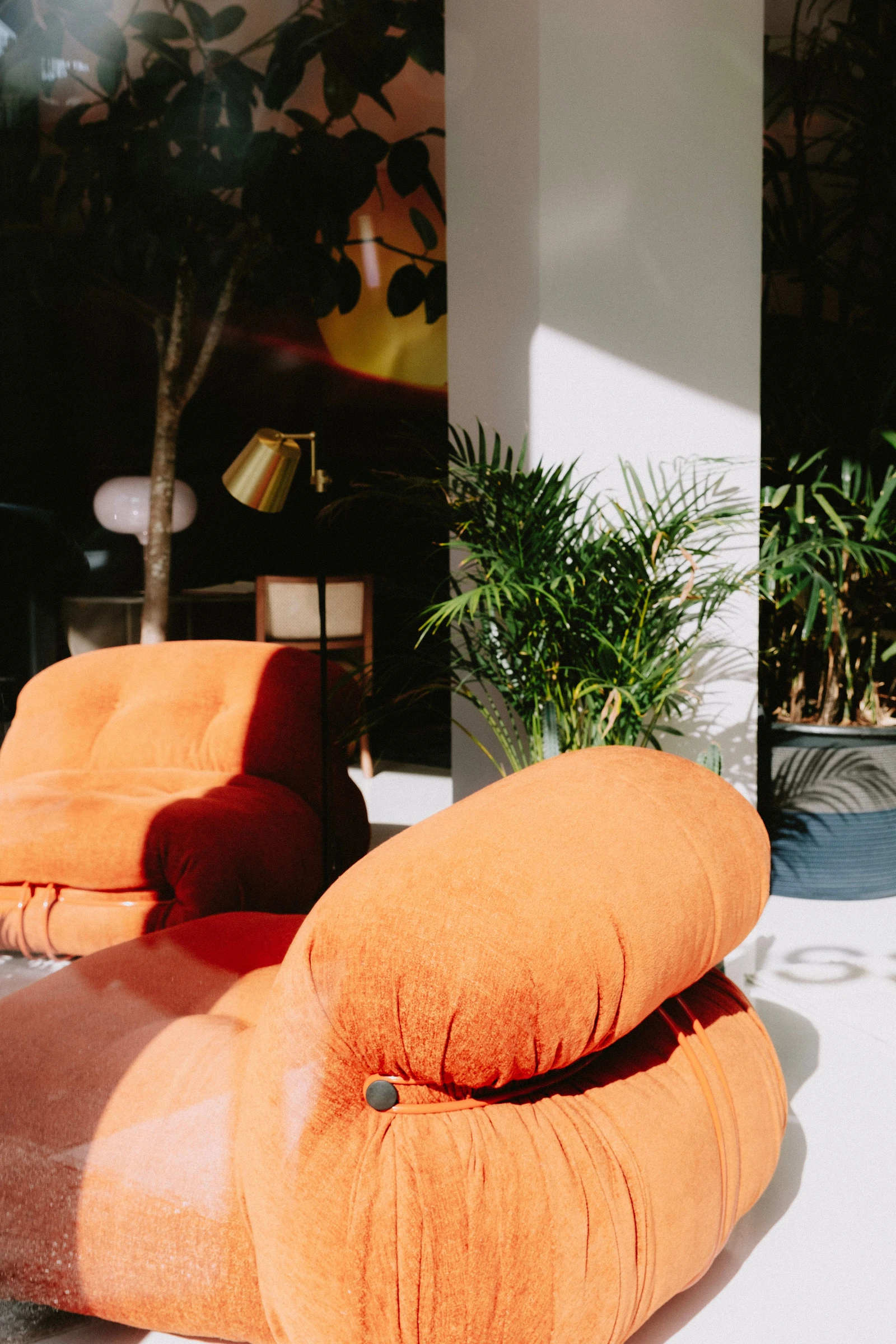
Orange upholstery gathers around a small dark fastening. Above it, a cushion swells into a generous curve; behind it, a pale column cuts a straight line through the room. In Mathias Reding’s photograph, the soft shapes of two chairs meet the crisp geometry of the architecture. Leaf shadows cross the column. Sunlight brings the folds of fabric into sharp relief. 4
The color arrives first, but the differences hold the attention. Rounded seats, narrow fittings and delicate foliage each have their own outline. Together they offer a useful starting point for an interior assembled over time: give the room a clear relationship between its parts, then let each part have a character of its own. A shared color is one way to begin. Shape and texture can carry the conversation further.
One color, several voices
A color becomes more interesting when it moves between surfaces. Imagine a tobacco-colored linen curtain beside a polished wooden cabinet. Their shades might be close, yet the curtain folds into soft bands while the cabinet holds a crisp edge. Add a small honey-colored bowl and the family expands again. The repetition is quiet enough to be discovered.
That approach can begin with what a New York apartment already contains. A reddish floor, cream window trim or dark mantel establishes a palette before a sofa arrives. Picking up one of those tones in a fabric can make the architecture feel considered. There is still latitude for a blue chair, a black lamp or a painting whose colors belong entirely to themselves.
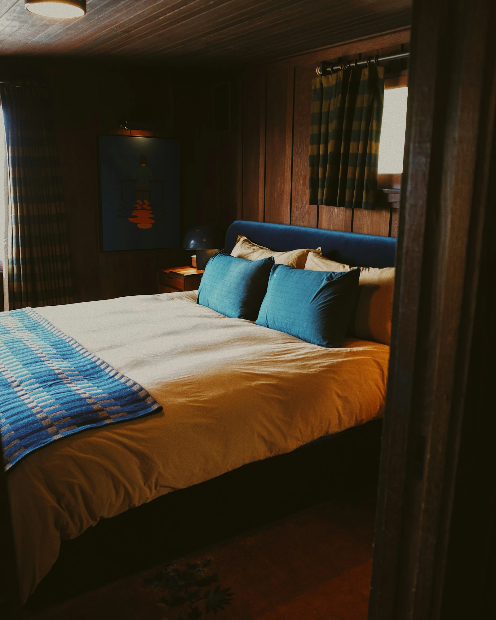
In the bedroom photographed here, blue cushions and a blue headboard sit against deep timber. Golden bedding carries some of the wood’s warmth onto the bed; the checked throw adds another scale of pattern. The broad areas of color do the organizing. Smaller marks can then bring complexity without asking every object to perform the same task. 5
Give the eye an edge
Texture becomes easier to read when something nearby gives it a boundary. A rounded upholstered seat looks especially yielding beside a narrow metal frame. A loosely woven textile makes a smooth tabletop seem more exact. These encounters give a room definition, even within a restrained palette of brown, cream and black.
Marcel Breuer made the structure of a chair unusually visible in his 1925 Wassily design. The Metropolitan Museum of Art’s example combines chrome-plated steel with canvas upholstery; its account traces Breuer’s interest in tubular steel to the lightness and strength of his bicycle. Frame and fabric have separate jobs, and their meeting is part of the chair’s appeal. 1
The idea travels beyond a particular piece of furniture. A slender side table can sharpen the outline of a deep sofa. A plain shade can give a heavily worked lamp base a pause. In a room with elaborate molding, a few simple profiles leave the architectural detail clearly visible. The contrast works through proportion as much as through the materials themselves.
There is also a useful question of emphasis. One emphatic curve may be enough beside a wall of straight shelves. Several equally sculptural pieces can compete for the same patch of attention. Looking across the room from its entrance helps reveal which shape leads and which objects are happy to accompany it.
Let a material surprise you
Wood is often asked to supply solidity: a broad dining surface, a substantial cabinet, a deep sill. It can also carry a remarkably light line. Alvar Aalto’s 1932 Paimio armchair uses a pressed birch-plywood seat shell suspended within a bent birch frame. Artek’s description identifies just four points fixing the seat to its frame. The material curls, lifts and encloses space. 2
That change of scale is worth borrowing. Beside a heavy wooden table, a chair with an open back can let the floor remain visible. In a timber-rich room, a small lacquered surface introduces a different finish while retaining a clear silhouette. The pieces need a relationship, but a matching stain is only one possible way to establish it.
For an apartment that already has strong finishes, the most useful addition may therefore be a modest one. A pale woven seat against a dark cabinet can change how both are read. So can a ribbed ceramic vessel on a flat stone shelf. These are small encounters, close enough to notice while putting down keys or drawing up a chair.
Samples help when the choice is less easily reversed. Place the actual upholstery beside the existing floor and the intended table finish. Look at them together from across the room, then at arm’s length. A texture that reads as lively in the hand may become almost plain at a distance; a large pattern will assert itself much sooner.
Make room for the familiar
The surfaces people return to deserve particular thought. For Charles and Ray Eames, the lounge chair was an exercise in welcome as well as construction. Herman Miller’s account connects its molded plywood and upholstered cushions to the English club chair, and to Charles’s idea of a baseball glove already softened by use. Familiarity was part of the ambition from the beginning. 3
A room can accommodate that feeling without being filled with celebrated designs. The chair kept through several moves, a bowl bought for its pleasing weight, books with uneven spines: these things introduce differences that are specific to the people who live there. Give them useful positions and a little breathing space. Their place in the room becomes clearer through use.
Return to the orange chairs and the eye begins to find smaller pleasures: a dark circle against the fabric, a fan of leaf shadows, a golden lamp tucked behind the seating. The broad shapes make those details legible. Warmth comes from the color; character gathers at the places where one surface meets another. A room becomes more interesting when it lets those differences show.